Perspective
This is the chart of a strong, valuable currency.
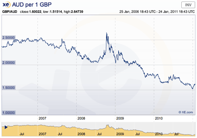
Source: XE, xe.com
Oops. Did I just post the wrong chart? Nope. Even if the chart is downhill, it doesn’t mean that the news is bad. Perhaps you’re looking at it the wrong way. Perhaps you just need to change your perspective.
We think in conceptual metaphors. Our language and culture influences the way we think. In a Western English culture, we’d rather be “up” than feel “down”. We’d rather see “numbers climbing” and “sales soaring”. We’d rather feel “on top of the world”. You never want to “plateau”, and it would be even worse to have “peaked”, because it would all be “downhill” from there.
We’d rather see a chart that looks like we’re approaching the top of a mountain. We’d rather see a chart like this:
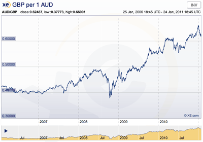
Source: XE, xe.com
Much better. This is the chart of a strong, valuable currency. It’s exactly the same data as the last chart, but now you can see clearly that the Australian Dollar is worth 50% more than it was just 4 years ago. All you needed to do was flip the graph. Same facts, different perspective.
Change your perspective, and things can become clearer.
Here’s one more chart. This particular chart is of the United States, often called the Richest Nation On Earth.
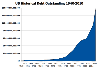
Source: US Department of the Treasury, treasurydirect.gov
It all depends on your perspective.
24 January // ©2011 Kohan Ikin.